Friday, August 31, 2018

Wishing You Well


I just participated in an online swap. We are a group of stampers who wanted some WOW samples using new products that are going to be in the upcoming SU! Holiday Catalog to show to our customers. What is a WOW sample, you ask? Well, it is a card that makes you say, "Wow"! when you see it. I tend to lean towards a more clean and simple look so I was a little worried that my card wasn't "wow" enough, but I am pleased with the card I came up with. Here it is:


I just love the new stamp set, "Wishing You Well". It is a Dist-INK-tive stamp set by Stampin' Up! What is this? It is a stamp set that has been made using a photo of the images. They are so realistic and stunning. I just love the images in this set and the font is just adorable. It has such a delicate feel to it and I am in LOVE!!!

I took my color palette from some new DSP that will also be in the new holiday catalog. It is called Country Lane Designer Series Paper. It has some rich, fall colors in it. Here is the color palette that I used:


Aren't these just lovely? 


If you look closely, you can see that I used Wink of Stella on the bow to add a little shimmer. It is kind of hard to see here, but trust me, in real life it is so sparkly. I also took some Basic Pearls and colored them with the dark Daffodil Delight Blends marker and the new, dark Blackberry Bliss Blends marker that will be in the holiday catalog! I love getting more Blends colors. So exciting!


This card has a fun fold. I am not sure what it is called, but I think it is pretty neat. It is simple to make, but different than your usual card. I stamped that lovely bow again on the inside of my card to pretty it up. 


The inside of my card uses another sheet of DSP from Country Lane that is just beautiful! It coordinates with a new product that you are just going to LOVE!!! It is the Tin Tile Dynamic Textured Impressions Embossing Folder. I used it on a card I shared previously here. Isn't that gorgeous? Swoon!

I'm glad you joined me again today and I hope that I have inspired you to get creating! 


Wednesday, August 29, 2018

As You See It Animal Outing

Hello stampers! I hope your day is fabulous so far. I am so glad you are joining me today. I wanted to share something I did last week. I am so excited!!!

Last week, my mother-in-law was in town for a few days. She asked if I wanted to do freezer corn while she was here. Of course, I did!!! We just love fresh, freezer corn. I know, that doesn't make sense but about 45 minutes up the road from St. George, UT, there is a little town called Enterprise. They are famous for their corn that they grow up there. They even have a huge "Corn Festival" every August. Folks, this is the sweetest, tenderest corn you have ever eaten in your entire life! Seriously! You haven't had good corn unless it is Enterprise corn.

Anyways, we got together in the afternoon and started shucking. This isn't my favorite part, but it has to be done. I hate it when you find a caterpillar in them. Yuck! I know they don't hurt you, but it is so gross because they can make things a bit mushy. Ick! After we shucked about two, big boxes of corn, it was time to go inside and start cleaning it. This is the absolute worst part. You know what I mean. Having to get all those little hairs off of the cob. Ugh! Not fun. Luckily, my MIL and I took turns so neither of us had to do it all. 

After getting it all cleaned, we started blanching it in batches. This is where you bring the corn to a boil and let it boil for 3 minutes. You then put it in a clean sink full of cold water and ice. Let that cool and then let the cobs drip dry on a towel. After they have dripped for a bit, you take and cut all that lovely corn off the cobs into a large bowl. We then put the corn in pint size, Ziploc bags and freeze them. 

Here is the fruits (or shall I say, veggies) of our labor (That was bad, I know):


We did 41 pint bags of corn! I am so excited!!! We love this stuff. 

AnyHoo... I digress. On to what you probably came to see. A card.

 I used the sketch over at As You See It. Here is my card:


And here is the sketch:


I love the repetition of images near the bottom of the sketch. I was going through my stamps and was looking to see what image would work. I had candles, but I wanted something different than what was on the sketch. I kept looking and found my "Animal Outing". I received this stamp set at Stampin' Up!'s April OnStage and had yet to ink it up. I can't believe it! It is such a darling set and I have seen some super cute samples made using it. Before I go further, let me share with you my color palette:


Here is what I did with the sketch:


I took that darling giraffe and stamped him a few times across the middle of the card. Here's the cool part, the DSP that coordinates with this stamp set, "Animal Expedition", has images that can be cut out with the coordinating dies, "Animal Friends Thinlits". Isn't that awesome? I love that because I really wanted to use this sentiment for this card and have two giraffes looking at each other, but the giraffe only looks to the right. Hmmm....what to do. Well, on a sheet of the DSP, there are giraffes that look to the right AND the left! I cut out the giraffe looking to the right and then took the sheet of DSP and held it up to my window (you could use a light box, but I don't have one.) and lightly traced the giraffe on the opposite side. I then put the die on my penciled giraffe and cut it out. Cool, huh?  I placed them facing each other and put them on dimensionals. I used this fabulous leaf ribbon to finish off the card. I love it!


A small sentiment from "Itty Bitty Greetings" and a strip of DSP and the inside was finished. 

Thanks for visiting today. Make sure to subscribe to my blog by signing up with your email to the right. I look forward to seeing you again!

Tuesday, August 28, 2018

Just Add Ink to Painted Harvest

Hello everyone! I have another card for you today. I want to make sure that I enter this card in time for a challenge. Fingers crossed!

Anyways, the challenge is over at Just Add Ink. It is a color challenge.


Just Add Ink Colour Challenge #423

I had the hardest time trying to figure out what I was going to do with these colors. I do not like to mix warm (Soft Suede) and cool (Basic Gray, Silver & Bermuda Bay) colors together. They just don't seem to work, but I was determined that I was going to try and do it.  Here is what I came up with:


I used the stamp set, "Painted Harvest". I think this is such a great stamp set. I love the watercolor images in it and it has the loveliest fonts. 

I felt like the Bermuda Bay was really bright so I toned it down by stamping off before stamping the bottom layer of the flower and I sponged the Bermuda Bay panel in the background with Soft Suede ink to give it an aged look.

I think I don't mind this color combination. I love what the design team did with it and I like how my card turned out. You really can mix warm and cool colors together. (Although, I don't know if I will be doing it anytime soon!)


I used the new sprig punch that will be in the upcoming Holiday catalog. I love this punch! It adds just a little somethin', somethin' when you need it. So cute! 

For the sentiment, I used a die from the "Lakeside Framelits" The die is actually bigger than this, but I cut out one end of the sentiment and then put the die a little closer to the saying and cut again. I wish I had taken a picture of this. It is hard to explain exactly what I did. I basically shortened it. Next time I will take pictures of the creating process. 

Do you see the little embossed/die cut "x"'s on the thin strips of gray? I just love that little touch! That die is from the "Stitched Labels Framelits" and it is amazing! There is also a straight, stitched edge die also. You have got to get these dies!!!


On the inside of the card, I put a sentiment from the same stamp set and added some greenery to the bottom. I really like decorating the inside of my cards. Even if it is just a sentiment and a strip of washi tape or DSP. It just adds that little, special touch. 

I hope you enjoyed my card. I would love to see what you create with this color combination!

Don't forget the August specials! You only have a few more days!


It's a Farmhouse Christmas!

Hello everyone! Today I have a card for you made using a challenge sketch. I just love sketches! They are a great starting point in the creative process. Here is my card:


And here is the sketch:


Isn't this a great sketch? I love the tilted panel and this lends itself to a clean and simple card.


I used the new stamp set, "Farmhouse Christmas". It is in the upcoming Holiday Catalog. I just absolutely love it! It has some fun images that take me back to my small town where I grew up. I used the "Merry Christmas" stamp. I stamped it twice. Once in Garden Green (okay, I didn't look close enough and used Garden Green when the color in this DSP is actually Mossy Meadow. Oops! I still think it works.) and once in Cherry Cobbler. I cut out the green sentiment with the Stitched Shapes dies and the Cherry Cobbler one with the dies that coordinate with the "Farmhouse Christmas" stamp set, "Farmhouse Framelits Dies". I then mounted the green circle onto a Cherry Cobbler scallop circle cut from the Layering Circle dies and adhered that to the card with dimensionals. I then added the "Merry Christmas" banner to the circle with dimensionals.
A little dry embossing and twine that coordinates and my card is complete.

Here is my color combination that I used:


I did add a sentiment from the stamp set and some stamped trim to decorate the inside of my card. 

I hope you were inspired today to create something of your own. Don't forget! You only have a few days left to get the Blended Seasons bundle and take advantage of Bonus Days. Click on the links above and to the left for more info. 


Sunday, August 26, 2018

Get Well Soon with Healing Hugs


Hello everyone! I have a pretty card for you today. I sometimes find it hard to make Sympathy or Get Well Cards. I try to have a few on hand because I find it difficult to create when the mood is somber and I have to come up with a card that will convey how I feel. I always feel like I can't capture my feelings on paper at difficult times. Maybe that's different for you. Some people are able to let their feelings guide them into creating something that expresses exactly how they feel. If you are one of these people, you are very lucky.

Anyways, on to my card:


We made this card for card class in June. I just love the soft, subtle color palette. It is very comforting to me. Here are the colors I used on this card:


I took the colors from the Specialty Designer Series Paper, Tea Room. This is such beautiful paper. It is thinner than our regular DSP so it doesn't add a lot of bulk to your card and it has so many beautiful prints. I used just a small strip of the DSP, but it adds some color and contrast to the card. 


I also used the Delicate Lace Edgelits. Aren't these just beautiful? I love being able to add a pretty trim to my cards and these edgelits do just that. There are three different dies in the set. Click here to see a few more ways you can use these edgelits. 

To create the different colors in the rose, I first stamped the whole image with Crushed Curry ink. Then, before stamping, I took a sponge dauber and randomly inked around the rose with Mango Melody ink. I then stamped the rose onto my card stock.

I stamped the leaves in Old Olive ink.  Aren't they just beautiful? I love these DistINKtive stamps that Stampin' Up! has come out with. They are stamps made from a photo so you get a very realistic looking image. Just gorgeous!


We also decorated the inside of the card with a sentiment and other images from the stamp set, Healing Hugs. I love a little something on the inside of my cards. It just adds that special touch.

Thanks for visiting my site today! I hope I have inspired you to create something pretty and meaningful for someone special in your life.

Don't forget, you only have a few days left for the Blended Seasons Special and also Bonus Days!


Saturday, August 25, 2018

CAS(E) this Sketch Missing You

Hello everyone! I am excited to share another card with you today. Today I am using sketch #286 from CAS(E) this Sketch! Here is my card:


And here is the sketch:


I flipped the sketch so that I could make an eclipse card. I love this type of card. It is where you cut out letters that make the work you want to highlight or "eclipse" and then mount the letters on dimensionals so that it looks like the word is "eclipsed". It is such a fun card to make and really makes a statement. You can see a close up of it here:


I did a watercolor wash on watercolor paper with the following colors: Pumpkin Pie, Cajun Craze and Cherry Cobbler. I used an Aqua painter and started with Pumpkin Pie. 


I colored the whole piece of paper and then dried that with my heat tool because I didn't want to wait for it to dry on its own. I'm a little impatient. After that was dry, I then colored in random areas with Cajun Craze and Cherry Cobbler to add some dimension and make it interesting. 

I let that dry and then heat embossed the lovely leaf image from the exclusive "Blended Seasons" stamp set that is only available this month or while supplies last. I used Gold embossing powder as it looked just wonderful with this color palette. 


I cut out "MISS" with the Large Letters Framelits using my Big Shot. I then took the "I just miss you" sentiment from the same stamp set and used washi tape to mask off the "miss you" part. I inked it up and stamped the "I just" above MISS and "you" under it. 


I put mini dimensionals under the large letters and placed them on the card where I cut them out. I then mounted this piece on Cherry Cobbler card stock and that onto a Pumpkin Pie card base.

Here is the color combination used for today's card:


I really like the warm colors on this card. They remind me of fall, which I am soooo ready for! 

I just love how this card turned out. Wouldn't this be so fun to find in your suitcase when you were traveling away from loved ones or if you had to take an extended trip?  I would love it!


Friday, August 24, 2018

Beautiful Baubles

Hello stampers! I am so excited to share some new products with you today! The new stamp set and dies I am showcasing are in the upcoming Holiday Catalog. These are some of my favorite products. 

I also used the sketch for Freshly Made Sketches 351. It is such a simple, yet lovely sketch. I knew immediately what set I was going to use for it. Here is my card:


And here is the sketch:


I used the lovely stamp set, "Beautiful Baubles" and the coordinating dies, "Detailed Baubles". Isn't this just lovely? I love that there is one die, yes one folks, to cut out all six ornaments. There is another large ornament that is included in this set and some lovely sentiments in a beautiful font. 


As you can see in the photo above, I heat embossed my image with Silver embossing powder. I think it adds a touch of elegance to the card. I used my watercolor pen and ink pads to color in the ornaments. Super easy and quick. I also love the use of non-traditional Christmas colors on this card. 

Here are the colors I used:


I had three more ornaments that were left after I used three on the front of the card. I couldn't just throw them away or not use them, I figured, why not jazz up the inside of my card? I used glue dots to adhere them and took a ruler and my Smoky Slate marker and drew the lines for the hangers. As you can see, I missed the mark on that blue, round one. Oops!

I hope you liked my interpretation of the sketch and are excited to get your hands on this lovely bundle. If you need a demonstrator, I would love to be yours! Just sent me an email to mindyclove75@gmail.com and I can get a new Holiday Catalog out to you right away.

Don't forget! You only have a few more days to get the Blended Seasons bundle. For more details, click on the link to the left. Also, don't forget Bonus Days! For every $50 you spend in August, you will get a $5 coupon to spend September 1-30! What a great deal! Go ahead and click on my link to my Stampin' Up! store to the right and shop with me today!


Wednesday, August 22, 2018

Lily Pad Lake Birthday


Here is the last card we made for August's card class. There is a new stamp set in the 2018-2019 annual catalog called, Lilypad Lake. It comes as a bundle with coordinating dies. It has such wonderful sayings in it. It also has some nature inspired images such as, an egret, lily pads, boats, water, etc... 

I wasn't too sure about this bundle at first, but after using it a few times, I am really loving it. You can use it for so many occasions. Today's card was a birthday card. It is more masculine as I am always needing masculine cards it seems. 


The color combo used for this card is:


I CASED this layout from another blogger, but I am sorry to say, I don't remember who it was. Oops! I just loved the simple layout though. Please let me know if you recognize whose it may be.


I love how the sentiment just pops on the Navy tag. I love heat embossing, but forget to do it a lot. Also, it can be a bit messy, but always looks great. 

Don't forget this month's specials. Click on the boxes to the left to check them out! If you need to shop, click on my "Shop With Me" link or click directly on the products below.

Tuesday, August 21, 2018

Abstract Impressions Take 2

Today I'm sharing with you another card that we made for this months card class. We used the Abstract Impressions Stamp set again. This is one of my favorite stamp sets from the 2018-2019 annual catalog! It is just so beautiful. 


This was an easy card to make. There is a little stamping and some more of that gorgeous Garden Impressions DSP. This is one of the sides that has watercolor images/splotches. I don't know which side I like more!

I really like the color palette of this card. Gray Granite is one of my favorite neutrals right now. It is a new color in Stampin' Up!'s color revamp and it is awesome. It is a gray with warm undertones. It goes well with so many of our colors. Here is my color combo for this card:


Isn't this such a pretty color combination? 


I love using our Textured Impressions Embossing Folders. They add so much texture to a card instead of using plain card stock all the time. It really makes a statement.

I love the three-step stamping of the flower. It really makes it pop with all the colors. I hope you get a chance to get this amazing stamp set and ink it up. You certainly won't be disappointed. To get yours, click on the link to the right and Shop With Me or click on the  images below.

Monday, August 20, 2018

A Happy Wedding with Abstract Impressions

I'm sorry I haven't blogged in a couple of days. I ended up with  a flu bug. I don't know how that happened. It is much too hot here for any cooties to survive! I am so ready for Fall weather. This heat has got me beat!

Anyways, on to my card for today. This is one of the cards we made at my monthly card class this month. 


I just love the colors! I took the color combination from the 6 x 6 paper stack, Garden Impressions. I just think these papers are gorgeous. They have lovely, floral images on one side and abstract, watercolor images on the opposite. So pretty!  Here is my color combo for this card:


Isn't that a lovely, color combination? So soft and pretty. I thought these colors would look really nice on a wedding card. 


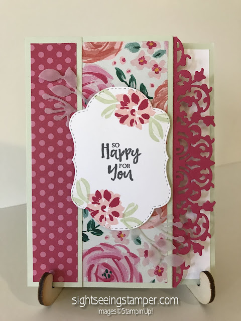
If you look closely, you can see that I used a few dies from the special promotion Stampin' Up! is holding in the month of August. The dies from Stitched Seasons are the center die and the vellum cutouts. 

Another gorgeous die is that Melon Mambo, ornate die on the right of the card. Isn't it stunning? There are three dies in this set that just add style, sophistication, and fun to your cards. These are my favorite dies in the annual catalog!

I hope you enjoyed my card today. Don't forget to order your Color Your Season bundle today while they are still available. Also, don't forget Bonus Days here in August. For every $50 you spend August 1-31, you will receive a $5 coupon to spend September 1-30. That is an awesome deal! Shop with me today!

Saturday, August 18, 2018

Peaceful Reflection


This is one of the cards that we made in my card classes this month. Everyone really liked it, but after seeing everyone make it, I will stick to something easier from now on. It doesn't look too bad, but there is a lot of stamping to be done! 

Anyhoo, I used a sketch from Stamps To Die For by Patsy Waggoner. She has a series that she does called "Sunday Sketches". This is the sketch I used:


This is the card that I came up with using the sketch:


I used the Peaceful Reflection stamp set. I received this set as a Prize Patrol Giveaway at Stampin' Up!'s OnStage Local in April. This is the first time I have inked it up and it is adorable. SU! designed the stamps so that if you flip them over and stamp using the opposite side, you will get the look of a reflection of the stamp. So cool! 

There were a lot of steps to stamping this card, but it did turn out how I imagined it would. I loved the color palette of this card. I pulled it from the "Tranquil Textures" DSP. One of the things I love about our papers is that they are a great starting point in finding a color palette. They take out all the guess work. Here are the colors I used:


I also used the Stitched All Around bundle for the sentiment. Have I told you yet that I am in love with these dies? I've decided that I am in love with most of SU!'s dies. LOL! 

If you would love to get your hands on the products used to make this card, just click on the "Shop With Me" link to the right, or click on the images below and that will take you directly to the items in my shop. Thanks for stopping by! Be sure to sign up to receive my posts in your email!